I had lunch with Glenna (Knitting to Stay Sane) not too long ago, and talk turned to design work. (We were both working on Super Seekrit Projects which cannot be discussed at present, except to say that we were both wrangling charts.)
I do all my charting in Excel, personally. Mostly this is sheer laziness, since it’s the software I know best from my day job, and I can’t be bothered to purchase or learn another program! Anyway, I had some tips and tricks to share with Glenna, and I promised I’d make her a proper tutorial. I’m hardly an expert (at Excel OR at designing) but maybe this will prompt some others to share their tips and tricks too. Here goes!
❖ Updated at 5:10 PM, June 6, 2011, with the image I had forgotten to save…
(Disclaimer: I’m using a slightly aged Mac with Excel 2004 for this tutorial. Your version may look a little different, and controls may be in slightly different places… but every version of Excel I’ve tried will ultimately do the same things.)
First things first. The knit stitch is wider than it is tall, so adjust your cell size accordingly.
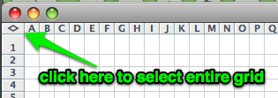
To make this really easy, you can select the entire worksheet with one single click of the mouse. Just click in the very top left corner, where the 1-2-3 (vertical) axis meets the A-B-C (horizontal) axis:
When you’ve got the whole thing selected, you can just grab the edge of column A and drag to adjust it, and all the other columns will automatically resize to match. The same works for rows, if you want to adjust those.
This is a good time to arrange your page setup, too. If you’re charting a shawl, chances are that you’ll want your page in landscape orientation; if the chart is for socks or mittens, you might want to keep it in portrait orientation. You can also specify that the pattern should be scaled to fit to one page width, so the pattern doesn’t break over multiple pages. (You may want to set your margins to be quite narrow, to maximize the area available for the chart itself…)
Now, it’s time to draw the gridlines for the actual knitted piece. Somewhere in your formatting toolbar, there will be a little icon showing gridlines. It leads to a drop-down menu; choose “draw borders.”
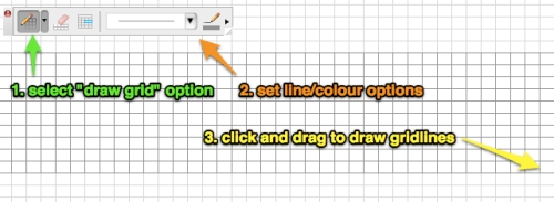
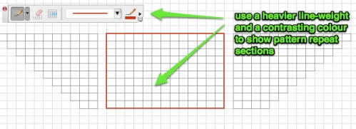
You should get a little toolbar something like the one shown below. The icon on the left will have a little pencil on it. Click on that and select the “draw grid” option. Set the line weight and line colour (I usually opt for a light line weight in grey, rather than black, but that’s personal preference). Using the draw grid tool, you can just click and drag to draw a box with all the gridlines filled in.
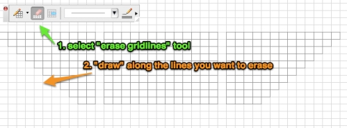
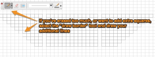
If you’re charting, say, a triangular shawl, or a lace edging with different stitch counts on each row, you can use the “draw borders” tool to erase or add single lines, too.
You can also use this tool to draw in the outlines of your pattern repeat, too. (“Draw border” draws individual lines or outlines, “draw gridlines” draws outlines and all the gridlines they contain.)
Now you’re ready to fill in the chart!
For a simple lace chart like this* you can get away with using a plain sans serif font (I used Calibri here). However, for more complex patterns, I recommend looking into a knitting-symbol font. Lots of people (including Kate Atherley, WiseHilda herself, who is a professional tech editor for Knitty, among other things) recommend Aire River’s free Knit Symbol font. I personally prefer StitchinKnit, which has symbols for a few more complex stitches, but it’s $6. (You know, that’s only the price of one pattern PDF.)
* I’m borrowing this lace pattern from the AeRang shawl by Jolene Mosley, available for free here. It’s a great pattern, but a good example of one that you might want to rechart for yourself before knitting. The original charts are… a little odd.
Now, here’s where Excel starts to really come into its own, for charting. When I buy a pattern with a lace or cable chart, I usually break out the highlighters and colour each symbol in, making it easier to read at a glance. When you’re making a chart yourself, though, you can easily make Excel do all the colouring-in for you! The trick is to use conditional formatting.
Take a deep breath — this sounds way more complicated than it really is, I promise.
Select the entire area of the chart (and the stitch key/legend, too), then open the Conditional Formatting tool. (Depending on your version of Excel, this might be under Format or Tools.)
Create a condition for each different symbol on the chart, as in this example:
Cell value is … equal to … =”\”
Next, click on the Format button, and choose a background colour for cells containing this symbol.
When the cell contains that particular symbol (“\”, for SSK, in this example), then Excel will apply the specified format to it (pink shading, here).
With the chart still selected, create another condition for each of the other symbols on the chart, choosing a different colour for each:
Hey presto! You have a finished lace or cable chart!
…
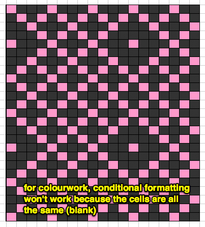
Of course, if you’re charting colourwork, using conditional formatting won’t work. Your cells (most of them, anyway) likely won’t contain any symbols, just colours, so there’s no way to write a condition formula to do the colouring for you.
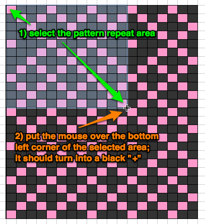
However, all is not lost. All you need to do is chart one full repeat of the pattern, and then Excel makes it really easy to paint that pattern over a larger area.
Just select the area of the pattern repeat, and move your mouse to the bottom right-hand corner of the selected area. When the cursor is directly over the corner, it will change to a small black “+” symbol.
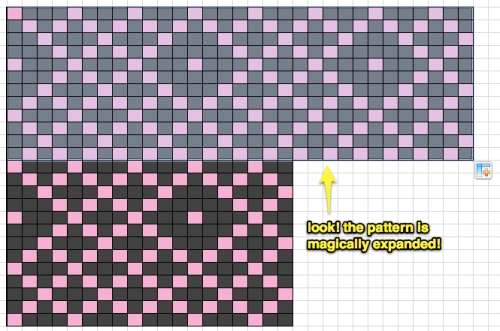
When that + tool is showing, click and drag across or down to paint the pattern across the space you want it to fill. (You can only drag across OR down at any given time, but once you’ve filled the pattern in one direction, you can select the whole new area and drag it in the other direction to fill the space…)
Just like that, you’ve filled in exactly the area you wanted, without having to copy and paste over and over. Also, copy and paste will only give you full repeats each time; using the + tool, you can fill in partial repeats without having to go back and trim the selection.
Bonus tip: This awesome little + tool is good for repeating the patterns of text/numbers in cells, too. For instance, if you’re numbering rows, you can type in 1, 2, 3, 4, or 1, 3, 5, 7, then select those numbers, and drag to expand the pattern as high as you want to go.
(After you use the tool, you’ll see a little box hovering next to the area that you copied, like in the image above. It has a little drop-down menu, if you click on it, and you can tell it to copy the cells, or continue in pattern, depending on whether you want “1, 2, 3, 4, 1, 2, 3, 4, 1, 2, 3, 4,” OR “1, 2, 3, 4, 5, 6, 7, 8, 9, 10, 11, 12,” respectively.)
You can also use the + tool just to paint the formatting for cells, or just the contents without the formatting, although those applications aren’t as useful for charting.
…
So, this is by no means comprehensive, but I hope it’s helpful. Did I miss something? Do you have any tips of your own to share?





YAY! Wise words from my favourite out-of-the-closet Excel addict! Thanks for the tutorial. 😀
My pleasure! Glad it’s useful… And yes, my name is Anne, and I’m an Excel addict!
This is very helpful! I have only used Excel for a few things, but it is capable for so much more!
I’m glad that this is helpful! It’s hard to know what’s common knowledge and what’s a new skill for people… Let me know if there’s something else that you want to do in Excel, and I can try to help more.